Yes, I am thankful. About a month ago, we had a terrible fire that burned our garage to the ground. The fire took the building and all four of our vehicles. Thankfully - no one was hurt. Thankfully - the firemen saved the house. Thankfully - we were insured. Thankfully - we can replace the "stuff." So yes, today, one month and one day later, I am thankful!
One thing that has gotten me through the pain of it all has been crafting. There were days that I picked a tutorial and just followed the steps through to completion. If it took me a day, great, because my mind was just so scattered elsewise. I have been wading through paperwork and phone calls and internet car-shopping (yep!), so the relief I found in creating cards, tags and art (love my Art Parts) was palpable. Now that things are settling down, I can breathe a bit again. But there is still art to be made!!
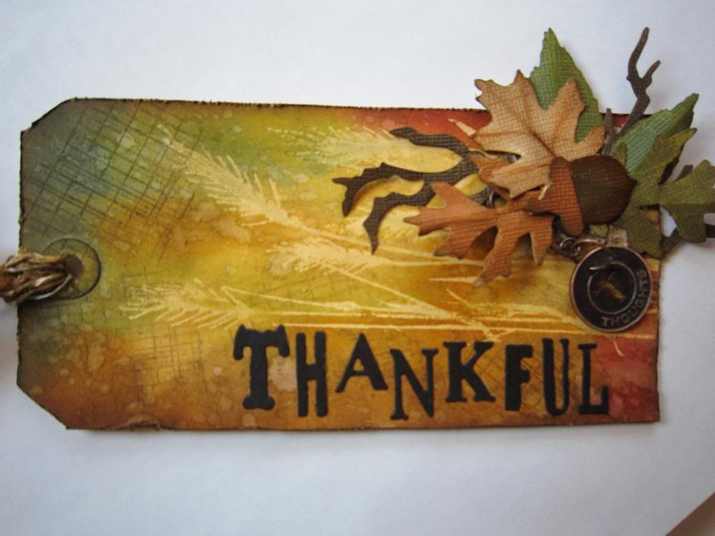
Here is a tag I made for Tim Holtz's monthly tag (Twelve tags of 2012). I didn't have some of the stamps n stuff he used -- I still need to resist the urge to buy every little supply for a project, lol!! I made do and had fun with this one - it uses a lot of the techniques we learned in CC101. It was nice to bring back old memories.
Monday, November 26, 2012
Wednesday, October 17, 2012
CC2 - Challenge 25
Whew... another week has flown by, but I am happy to say it was a fruitful one. I got my Wednesday Card Club in this week, having finished jury duty last week. Thanks again ladies for a wonderful meeting!! I also got in quite a bit of consecutive time in the craft room - it was very relaxing after the trial and I got to play with some of my new TH goodies.
This week we are thankful for SimonSaysStamp, as they are sponsoring the 25th Challenge for Linda over at Studio L3. This week's challenge is a technique found on page 53 of Tim's book. The technique is called "Ink Palette: Perfect Pearls."
I love Perfect Pearls, so the chance to create the palette and use them in a new way was intriguing. I was certainly impatient for the colors to dry!! But that gave me a chance to break out my tree die, my mini leaf dies, my new leaf blueprint stamps, and my Shrink Plastic!!
I created my background with some fall-colored Distress Stains, including my favorite - Wild Honey. Then I overstamped the oak leaf a few times in Archival ink (Orange, Olive and Coffee). Then I diecut my mini leaves from Shrink Plastic and shrunk them with a heat tool. After they were shrunk, I colored them with alcohol inks. I die cut the branch tree and used the woodgrain texture fade with some clear embossing powder. I then colored it with my new palette. Sweet!!
Here's another photo (I think with the flash on):
So there you have it. I had fun with this one and now off to tackle another crafty project!
I am entering this in the following challenges:
Thursday, October 4, 2012
CC2 - Challenge 23
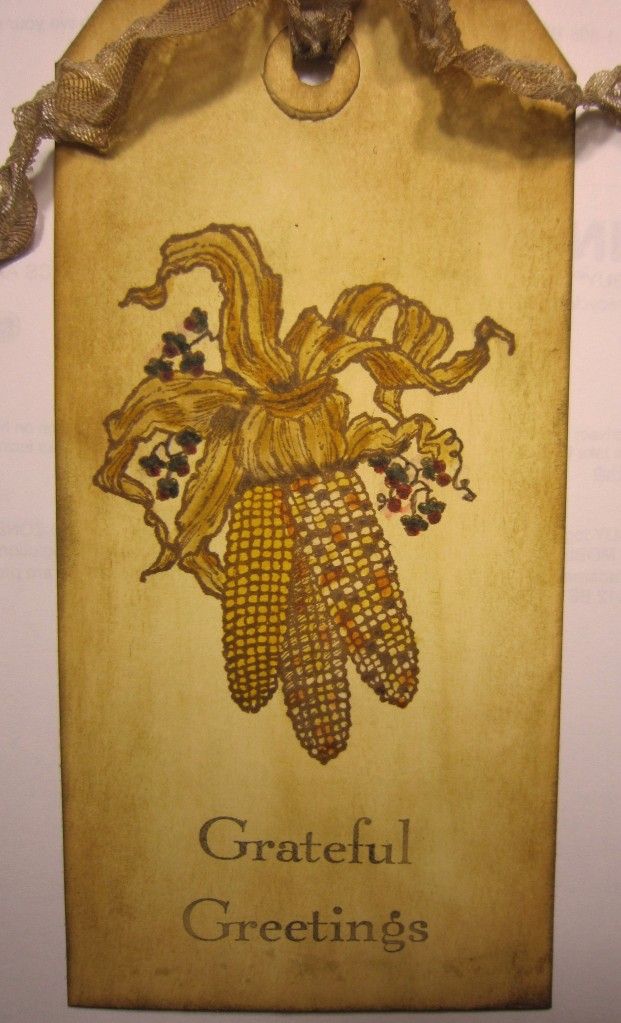
Simple little submission this week--I have been tied up doing my civic duty for almost three weeks now--more on that at another time--so I haven't had hardly any creative play time of any duration.
This week the technique, found on page 50 of Tim's book, is called "Distress Markers." I found this Indian Corn stamp (from Serendipity Stamps) in my stash, and the marker technique was perfect for it. Wish I coulda done more embellishing, but that's the breaks!
See ya next week, and thanks, as always, to Linda at Studio L3 for the fun!! I am submitting this to the CC2 Challenge no. 23.
Wednesday, September 26, 2012
CC2 - Challenge no. 22
Here's a quickie--my tag for CC2 - Challenge no. 22. This week's challenge is sponsored by Linda at the Funkie Junkie--thanks Linda and good luck with the new website... www.thefunkiejunkie.com (btw - the ribbon on my tag is some of Linda's crinoline that I bought a while back to make flowers--the crinoline is wonderful to work with and takes stain well!!)
Gotta go, so see yas next week!!!
Thursday, September 20, 2012
CC2 - Challenge 21
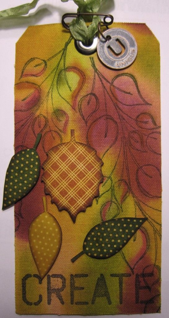
Here's a technique called "Blended Stains", which is found on page 45 of Tim's delightful book. I chose to use sticky-back canvas for my surface, and boy do you need a lot (read ALOT) of water to get the stains to blend on it. Once I had that figured out, I managed to come out with a decent blend. (I still hate my camera by the way--the oranges didn't come out orangy this time).
Anyways, I used a few Distress Stains for the background, then some Dyan Reavely leaf stamps, and a Wendy Vecchi phrase stamp. Nothing like spreading the love!!
Many thanks to SimonSaysStamp for sponsoring our Challenge this week, and of course more kudos for Linda at L3 for continiung the fun!!
Tuesday, September 11, 2012
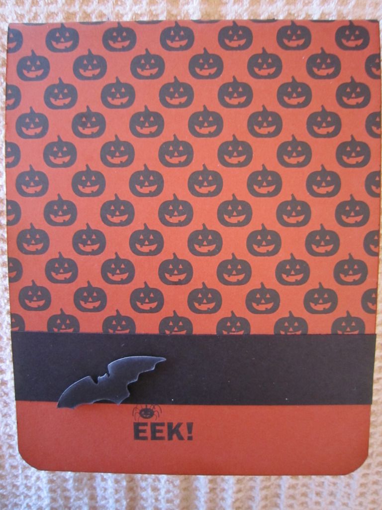
Pop 'n Cut Fun!!!
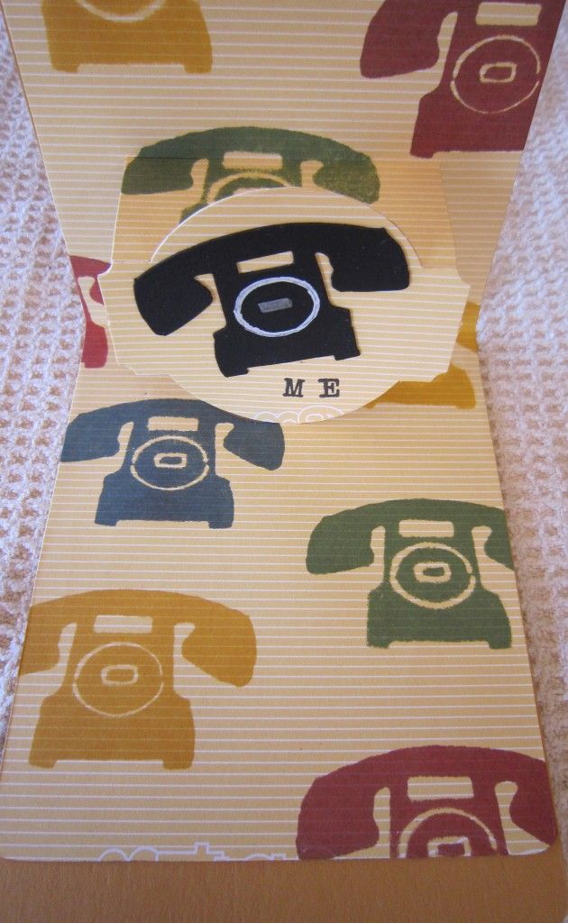
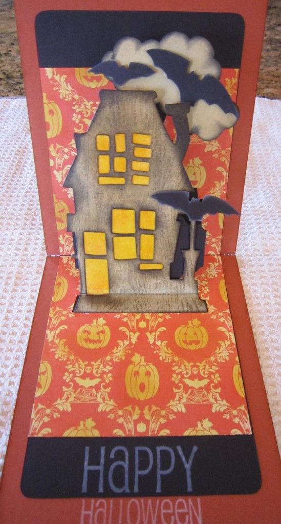
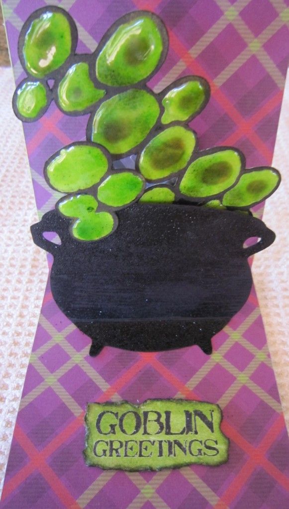
Hi all... I just wanted to post a little something NEW here. I had been seeing a new toy being used on the Sizzix blog and once I got my hands on it, I couldn't stop playing with it!! It is a new die from Sizzix called Pop 'n Cuts. There is one base die that you need, then there are several additional dies and Sizzlits you can get that coordinate. It is a line designed by Karen Burniston, and they have been selling like hotcakes!!
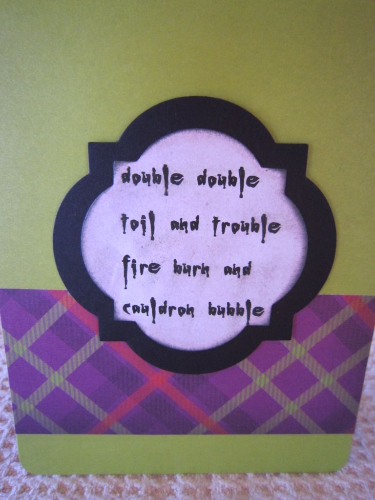
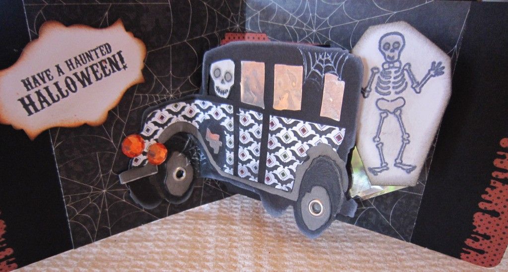
The base die and the additional ones make a pop-up card, and on the Sizzix blog, Karen took it a step further by adding a "spinner" action--what fun! She threw out the challenge to see what we could make that spins. I tried one of her designs first, a spooky hearse, then I jumped on the Halloween theme and came up with a few more. Some spin, some don't, but the spinning thing really had my creative juices flowing. And I even have a few more spinning ideas, lol.
Thank you Karen, for your products, your ideas, and your help!
Here are some humble pics of my work with more to come...
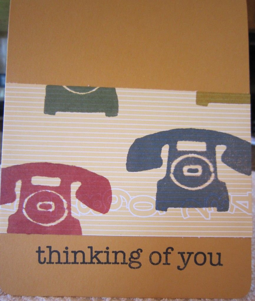
I didn't have phone paper... so I made a phone stamp from Tim Holtz's movers & shapers die using foam and stamped it in various colors.
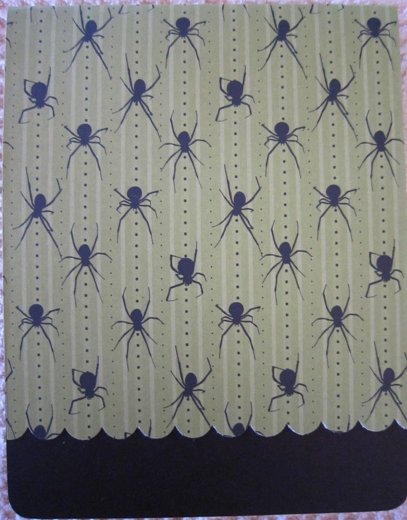
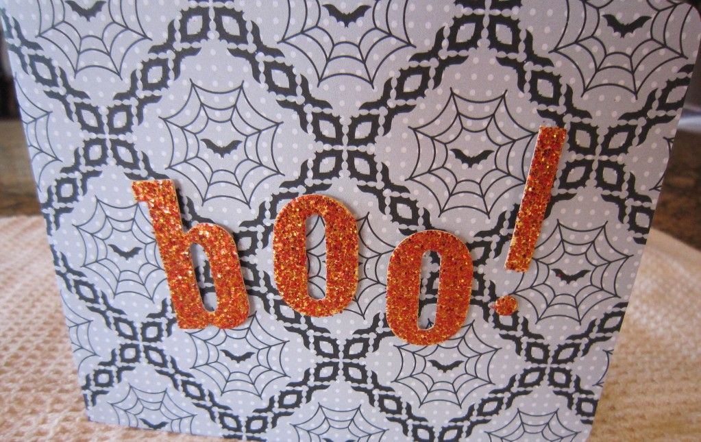
Didn't finish the outside of this one yet, waiting for yet another TH die, the Gothic Boo would look great on the front in black glitter paper, wouldn't it?
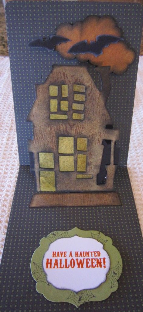
This first attempt at using the TH Rickety House got large on me... I fixed it in my 2nd attempt above. This one spins with the clouds and bats popping up!
This one was fun, the bubbles in the cauldron come "spinning" up!
This is my take on Karen's hearse... the casket comes spinning out behind the car. I used the Martha Stewart drippy goo punch on the edge of the paper. My first try at this one I had everything upside down... the bats on the paper for the car, and the spiders on the front.
I do apologize once again for my inadequate photography... See ya next time :-)
Thursday, August 30, 2012
CC2 - No. 19
Sweet fun for the Compendium of Curiosites Challenge No. 19. This week was Kraft Resist, found on page 41 of "da book."
I love the Kraft Paper (heheh, I love ALL paper) and although my silly camera and software editor never quite get the actual colors right, this one is close. Can't seem to figure out why the white background paper is sooo pink, but...
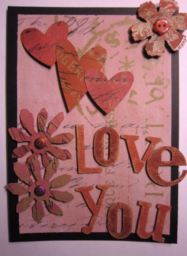
Anyways, this was a fun little card -- gonna store it for Valentine's Day for my sweetie. I broke out all of my pinks and reds--even got some Dylusions Postbox Red (love that name) in there on the hearts!! I used Picket Fence Distress Stain on the large Kraft postmarked piece, then went over it with Worn Lipstick to get a lovely pink. The hearts and flowers are all cut out of Kraft Resist as well.
Getting in under the wire again... thanks to Linda L for another week of "getting inky." Mwah!
Thursday, August 23, 2012
CC2 - the 18th Challenge!
So this week at Studio L3, we were challenged with the technique found on page 47 of Tim's book - a technique entitled "Whitewashed Stamping." I am sooo anal about cleaning my stamps that I cringed a little - LOL. But I got through okay - and this is a fun little way to make delightful backgrounds, too.
Many thanks to the Funkie Junkie Boutique for sponsoring this week's challenge, and to Linda for putting this all together every week!!
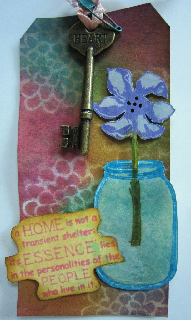
My tag is a little wrinkled (I am sad about that) and you can't see the Glossy Accents I used on the jar, but as usual I am running late with my entry. Has school started yet? Because I need more studio time and less summer-running-around-time!! Til next time!
This tag will be entered in the Studio L3 Compendium of Curiosities 2 Challenge #18
Thursday, August 16, 2012
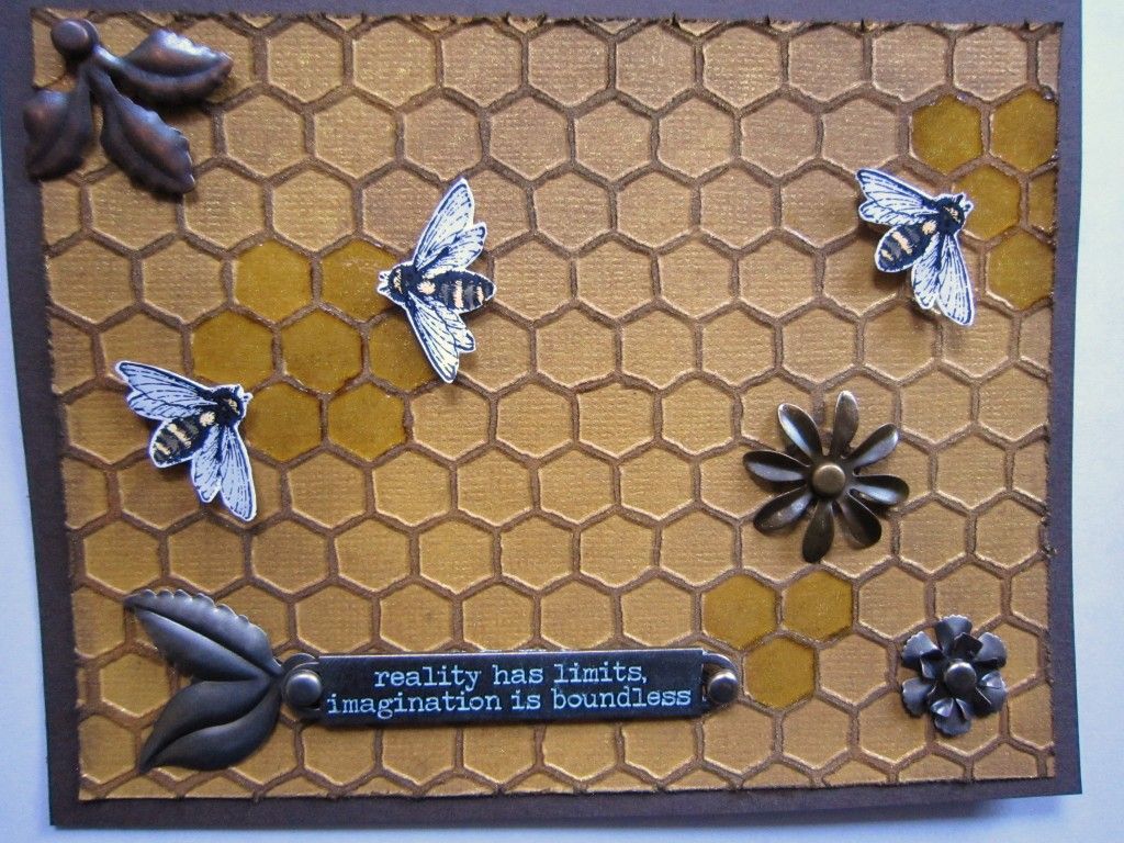
CC2 - Week 17
As always (well, almost) I like to make a card when I craft during these challenges. I have a good friend that I like to send cards to at least once a month, so this one will go to her.
I used some gold Perfect Pearls mist on the cardstock after I embossed and inked it. Then I added some cut-out bees, some trinkets and a wordband, and some Glossy Accents to finish things off.
Summer has been soo busy (bee-zy) and I have some new stuff to play with too--hopefully I can get to some more crafting soon!!
This card will be entered in the Studio L3 CC2 Week 17 Challenge
This card will be entered in the Studio L3 CC2 Week 17 Challenge
Thursday, August 9, 2012
CC2 - Week 16
Well I am squeezing this in again under the wire... the 16th Challenge from Studio L3 from Tim Holtz's Compendium of Curiosities vol. 2.
This week the challenge was Perfect Pearls Mist, the technique that is found on page 54 of the book. I make up a lot of my misters from scratch, so in being short of time, I used what I had pre-made, which was some purple and gold (gotta have gold) and some sunshiny yellow.
I added a few shattered stain butterflies and a sweet sentiment to finish off this card for my friend.
This will be entered in the CC2 Week 16 Challenge. Thanks as always to Linda for the fun!!
Thursday, August 2, 2012
CC2 Challenge - Week 15
I am skinking this in under the wire for the Compendium of Curiosities 2 week 15 challenge. I missed a few weeks of these challenges and I am happy to be back participating!!
This week's challenge is found on page 56 of Tim's book, and it is a technique called "Enameled Metals." Wow - this was so simple and yet gives you an absolutely fantastic result. After I finished the background, I didn't want to cover it up, and I certainly wanted to pass it on, so I made it into a birthday card for my brother.
I used just a couple of Tim's gears and corners for embellishment, then some diecut letters and a stamped sentiment and I love how beautiful it came out. Masculine yet classy. He will love it!
This is getting entered in the CC2 Week 15 Challenge. Can't wait until tomorrow for the next adventure!!
Sunday, July 29, 2012
12 Tags of 2012 - July
Howdy friends! I can't believe it has been almost a month since I last posted. But I did attend two AQHA shows in three weeks, including a Regional show. I had a ton of fun at both shows, and I am happy to say that in our first Regional and only our third show together, my faithful steed Bacardi and I finished a very respectable 4th and 7th in our two classes!! Thanks Mr. B!!
Anyways, I have been dying to do some kind of art... so this afternoon I finally found some time for the art cave, and I was able to make this card for entry in Tim's monthly tags challenge. I do not have any patriotic stamps, so I went with using an embossing folder (Tim's of course).
I used some Core'dinations paper and ran it through the Vagabond, then sanded it--love that paper in all of its forms. I did put some stickles on the stars, don't think it came out in the pic. Then I added the Ideology numeral and some red and blue ink to finish things off. More to come in August, but this little quick card felt great to do!!
Wednesday, June 27, 2012
June Tag - Tags of 2012
I am cramming in these creations the last few days, and I am in under the wire finally getting to my June tag for Tim Holtz's tags of 2102. This month Tim showed us a technique to colorize a printed photo using the Ranger craft nibs. They are cool, and even better, they are re-usable... just rinse them out when you're done and they are ready to go again.
Thanks once again to the The Graphics Fairy for her free graphic--the vintage photo of the young girl holding some roses. I tried two types of photo paper to print on, but both smeared when I went to apply the ink. So I decided to print on Ranger's Specialty Stamping paper. Worked pretty good, only got minimal smearing, even though I dried it with my heat tool.
Anyways, I used Worn Lipstick and Forest Moss DI for the roses, Tattered Rose for the hairband, and Scattered Straw for her hair. I finished colorizing the edges of the photo with... what else, Vintage Photo, lol!! A few TH embellishments finish off my tag!
Goin' Whimsical
Here's a whimsical little card I made for the Inspiration Emporium's monthly challenge, entitled "Create A Little Sunshine." I took the challenge literally, as I have used a nice bright sun, stamped from a set from Our Crafty Lounge. I haven't had my Copics out in a while and I thought this was a chance to try them on the Ranger Specialty Stamping Paper. That paper is fantabulous!! Copics have a tendency to bleed through a lot of papers, as you know, but the Ranger paper holds up extremely well... takes stamped ink beautifully as we know, so stamping in black is a breeze. And then the absorption of the Copic ink is just right for blendability. Love it!!
Thanks to the Inspiration Emporium for the chance to win a $50 gift certificate!!
Sunday, June 24, 2012
CC2 - Week 10, plus a photo inspiration
Howdy bloggers and welcome back. Living on a horse farm as I do, we just had a bit of haying... this is generally the time all of your friends disappear, as no one EVER wants to help with this particular chore. As hay season is the summer months, and we generally end up having to bale on the hottest days EVER, I can relate. So, 400 bales of first cut hay are put up and my fingers are killing me.... but not so bad that I can't type, heheh.
Anyways, onto crafting for the week. We had a one-week extension on our entries for the CC2 Challenge (yay!) and as I was interested in entering a couple of other ones, I let my juices stew, so to speak, so I could combine things. And that worked out for me. One thing I have been trying is to sketch out my ideas (but I am by no means an artist) and then see how they come together. Works pretty good for me and I know, of course, that a lot of others do this as well, I just had never tried it until recently.
So, onto my project here. This time around for Studio L3 (CC2), the challenge was Tissue Flowers. This technique is found on page 37 of Tim's book. (Linda, I hope the temporary graveyard shifts aren't killin' ya too bad--hugs!!) This week the Funkie Junkie is sponsoring with a chance to win a $25 gift certificate (thanks!!) And coincidently, there is the Photo Inspiration challenge over at Frilly and Funkie, and then Simon Says Stamp wants us to show a Bit of Brown... so I did!!
For my entry, I finally got to use my new Dylusions sprays (Lemon Zest, Fresh Lime and Vibrant Turquoise) and some of the Spring Distress Inks (Squeezed Lemonade, Peacock and Peeled Paint). I sprayed and inked using a mask to separate the colors initially, then just inked and inked and inked...
I also sprayed my tissue flowers with the Dylusions sprays and then I added some brown with some vintage buttons, a brad and a Wendy Vecchi Blossom Bucket piece.
For the rest, I used some Turquoise and Cobalt Archival Ink for the background and the flowers; the stamps are from Tim Holtz (background), Dylusions (flower) and Wendy Vecchi (sentiment).
I hope you like it--it was fun to make!!
I am entering this is in the following challenges:
Monday, June 11, 2012
CC2 - Week 9 and other endeavours...
Hello bloggers... I hope none of you have gotten the late spring cold that has gone through my family the last few days. Wicked sore throat, body aches, and general bleah feelings. Not sleeping too well either, but hopefully some Nyquil will help tonight. Almost didn't have the energy to craft this weekend... almost, heheh.
So this week at the Studio L3 blog, the week 9 technique is an altered Pocket Watch, found on page 35 of Tim's book. Simon Says Stamp is sponsoring this week as well, with the lucky winner receiving a $25 SSS gift certificate. They are also having any Anything Goes challenge, yay! Also this fortnight, we have the Frilly and Funkie: Kraft and Twine challenge, as well as the Our Creative Corner: Your Favorite Tim Holtz technique.
For my pocket watch, I took a piece of an old map and cut it to fit the inside of watch. After applying some Vintage Photo Distress Ink, I glue it to the inside. For my butterfly, I used my distress markers in Wild Honey and Vintage Photo... they blended well for my monarch. I printed out "dare to fly" on the computer (wanted to use Tim's ChitChat stickers, but no word 'dare' is included), cut out the words and inked the edges with Tumbled Glass distress ink. Watch complete! Here is a closeup:
For my tag, I used a Kraft tag and a piece of Tim's Kraft resist. I glued the piece of resist to the tag, then inked the whole thing with Tumbled Glass Distress Stain. Love how the resist paper "resists" the stain! I then added some Broken China and Vintage photo ink with my blending tool. Distress Ink blending is by far my most used, favorite, Tim Holtz technique!!
I added some background stamps in Archival black, and a grunge fly and another butterfly from a set of Wendy Vecchi stamps, both of which were also blended with distress inks. An altered Vintaj blank stamped with the word Fly, some hand-dyed ribbon and some linen twine finish off my tag!
I am entering this in the following challenges:
Thursday, June 7, 2012
CC2 - Week 8
Wow - we are into June already! And up to week 8 of the Compendium of Curiosities 2 challenge already as well. This week's challenge was soo much fun and one of the first ones that I've done where my ideas just flowed... with a little help from the Master for inspiration thrown in!
The technique this week is called "Repurposed Packaging" and it is found on page 62 of Tim's book. As the lovely Linda mentions on her blog this week, I too have quite a stockpile of acetate packaging (mostly from Tim's Idealogy stuff, hehe) that I've saved. I recently bought several compartment-type plastic organizers and put all of my Ideology stuff in them, and I save a bunch of the packaging, so it came in handy this week.
For my tag, I ran a piece of the acetate through the Vagabond using the rivet texture fade. Then I applied AI in silver metallic (one of the mixatives) and then burnished it with some Archival black. Perfect metal sheeting!! I stamped the bottom portion of the black tag with Snow Cap pigment ink, and added a bunch of findings and some foil ribbon and voila! Steampunk baby...I love it!!
I am entering this in the following challenges:
Sunday, May 27, 2012
Catching Up
Here is a little catch-up post that I have been wanting to get done for a while. Back in March, my mother-in-law asked me to make a card for her neighbor's mother. A Happy 100th Birthday card... I was like OMgosh, she knew someone who was turning 100!
So I set forth to make a very special card for a very special lady... I did case this idea from someone but for the life of me can't remember who (my apologies in advance). I used Tim Holtz's rusted enamel technique for the card background, along with lots of brown distress inks... some feathers and some pearls. The photo is printed on vellum cardstock and aged with Vintage Photo ink. I inked the edges of the flower with some Distress Ink in browns as well.
I made a lovely box in matching cardstock with a clear acrylic lid to hold the card, which was a little bulky with the feathers and flowers and such.
The birthday girl? LOVED IT!!
Now that I've caught up, I can enter this in the following challenges:
CC2 - Week 7
Set sail on the SS Holtz! I really had a lot of fun making my project for the Studio L3 Compendium of Curiosities 2 - Week 7 challenge. Thanks Daisy and the eclectic Paperie for sponsoring this week with a chance to win a $25 gift certificate!
This week's technique, found on page 49 of Tim's book, is called Brushless Watercolor. I used the technique on the ship stamp, with Pumice Stone stain, and then I added some highlights with Black Soot and Chipped Sapphire Distress Markers and a white gel pen.
I made the ship's wheel from Tim's mini cogs die and added a few Vintaj starfish charms to my netting. The netting was made from a mesh bag I picked up at the dollar store and dyed with Walnut Stain Distress Stain. One of Tim's corked vial's worked great for my message in a bottle and I made a few gold coins from embossed grungeboard circles to complete my scene on the beach.
I am entering this in the following challenges:
Studio L3: Compendium of Curiosities 2 - Week 7
Simon Says Stamp: Simon Says Stamp and Show ... A Summer Holiday!
Wednesday, May 23, 2012
May Flowers
Had a chance to make a "hello" card for my friend and as I have been playing with some Vintaj metal stuff--embossing, patina'ing, and making some jewelry as well, I decided to add the little dragonfly to the card.
Vintaj makes a complete line of brass jewelry components--chain, charms, findings, etc. But what I found most fun is embossing (yes--embossing) their metal blanks with their Sizzix DecoEtch or Deco Emboss dies. You use your Vagabond just like you would to emboss paper--so cool! Check it out on their website here, and their blog here.
Sizzix makes the Vintaj dies, and Ranger just came out with a line of patinas (paints) to color the metal with, and a sealer also. In addition, you can use Alcohol Inks and Adirondack paint dabbers to color the metal as well--the Vintaj blog has tons of ideas, tips and videos if you're interested.
I am entering this card in the following challenges:
Inspiration Emporium - Bring on the May flowers
CC2 - Week 6
AAghh! Well, here is my entry for the Compendium of Curiosities Week 6 Challenge. And NO MATTER how I tried (20+ photos) I could not get a decent picture of my work... phooey!
This week's technique, found on page 38 of Tim's book, is called Tissue Wrap Collage. We are lucky enough to have the Funkie Junkie's Boutique as a sponsor this week as well - thanks so much to Linda Coughlin & co. for sponsoring! And Linda at Studio L3 for continuing the fun and all the lovely comments each week!
I used the mini cabinet die to make a window from grungeboard and then followed the technique to complete my window. I was trying for a "looking out the window from a window seat effect"... oh well, there's always next week, LOL.
I had to add some of my extra faux enamel flowers from Tim's May tag, and I made a little terra cotta pot from a wooden one I found at Hobby Lobby (love that store).
I am entering this in the following challenges:
12 Tags of 2012 - May
Howdy bloggers! I have been crrazed the last week--had my hands in many projects, including some jewelry projects, and finally had a chance to get inky!! Made this tag for the 12 Tags - May edition and I have to say I love the faux enamel flowers Tim introduced us to! I made a bunch using the new Spring Distress inks--what fun!
Whenever I have the materials, I like to copy Tim's tag exactly so as to really cement the techniques in my mind (and hands) and also to see how I measure up to the master, heh heh. More to come next...
Tuesday, May 15, 2012
CC2 Challenge, Week 5
So this week's challenge over at Studio L3 is from page 48 of Tim's book. It's a technique called "Shattered Stains." And it is one of my favorites!! I really wanted to do something a little different with it this time, though. Whenever I have used this technique in the past, it was with flowers or leaves or hearts--smaller accent-type pieces. This time I thought I would try using it for the entire background.
So... I cut a piece of grungepaper from Tim's tag die and gessoed it first before I added the Rock Candy Crackle Paint. I was a bit impatient, so I dried the gesso AND the Rock Candy. It came out with lots of fine crackle, which was fine with me. I added some Distress Stains and I really like how the door came out looking like an old, weathered peeling door!
This week, the wonderful SimonSaysStamp is sponsoring Linda's challenge--thanks to them and of course, Linda, for another inspiring week!
I am entering this in the following challenges:
Studio L3: Compendium of Curiosities 2, Challenge 5
Simon Says Stamp: Simon Says Stamp And Show... Anything Goes
Thursday, May 10, 2012
CC2, Week 4
I have been very busy doing non-crafty stuff the last week... took my new horse to our first horse show and placed in four out of five classes! Not a bad beginning to our show careers :-)
Anyways, I am getting my CC2 Challenge entry for week 4 in under the wire. The technique is found on page 43 of Tim's book, and it's called Faded Layers. I know we did this technique during CC101, and now that I've used it here again, I really like it. Thanks again to Linda at Studio L3 for another fun week--tomorrow will bring the next challenge--whoo-hoo!
I used Pumice Stone, Broken China, Vintage Photo and the new Squeezed Lemonade and Shaded Lilac Distress inks. Wowee--do I like those Spring Distress colors!! I had a new Lattice template (love it) to try out, and after I stamped the balloon, I added some Glossy Accents (not sure it shows in the photo) to the balloon, a piece of burlap for the balloon's basket, some hand-dyed ribbon, and an "Enjoy The Journey" Idea-Ology wordband. Sweet!
I am entering this in the following challenges:
Monday, April 30, 2012
CC2, Challenge 3
So we are on week #3 of the Compendium of Curiosities 2 challenge, and this week's technique is "Marbled Stains," found on page 46 of the book.
I first learned this technique during our wonderful online class with Tim Holtz, Creative Chemistry 101, and now that I have had a little more practice with it, I am getting better at it. The trick for me is to use LOTS of white!!
So for this little card, after I did the marbling, I ran the cardstock through my trusty Vagabond using Tim Holtz's music texture fade. Then I inked the raised areas with some blues and browns.
I made the branch and birds with Tim's Bird Branch die; I inked and embossed the branch with some Distress embossing powders. I also embossed the phrasing in black on a couple of banners from Tim's Tattered Banners die. A few embellishments from my stash and some custom-dyed trimmings complete my card!
Many thanks to Linda at Studio L3 for these weekly doses of fun, and a shout-out this week to eclectic Paperie for sponsoring this week's challenge!
I am entering this card in the following challenges:
Friday, April 27, 2012
Watercoloring--finally!!
I recieved my long-awaited Distress Markers last week! It took me until now to get them out to play, but it was worth the wait--they are verrrry addicting. I am not much for using markers to color directly on the paper, so the fact that you can blend these guys with a water pen is AMAZING!!
Here I used watercolor paper, but I did try the markers on Ranger's Specialty Stamping paper as well. I have to play with that paper alot more as is has some very unique properties. More on that paper at another time. On to the tag...
I used a bunch of different colors to watercolor the parts of the tag. Sometimes I mixed on the craft sheet and sometimes I colored directly onto the paper and then blended with the water pen. I always seem to overdo it when I work with an image of the sun. I am always trying to capture the elusive glow of the sun and the different colors of a sunset or sunrise... I'll get it one day.
Here is a close-up of the twine-wrapped pen nib and I even colored the tips of the pens on the stamp!
I am entering this in the following challenges:
Inspiration Emporium's: Coloring Our Creative World…with Water
Simon Says Stamp: Anything Goes
Thursday, April 26, 2012
HOPE
So often in life one word, good or bad, can change a day, a friendship, a marriage, an outlook. The word I cling to lately is Hope. There are three people in my life who have recently been diagnosed with cancer. I believe that they can beat back that dreaded disease and continue their journey in this wonderful world!! I will do my part in encouraging them to have that very strong and powerful thing: Hope.
Along those lines, I created this tag to showcase that word and am entering it in the Simon Says Stamp and Show: Your Favorite Word challenge.
Wednesday, April 25, 2012
Mini Journal
A few posts ago I mentioned I had always wanted to get some of Wendy Vecchi's Art Parts to alter. Well, I finally got my hands on some and here is my little journal. I love to use butterflies on a lot of projects, and this one was no exception. The Art Parts that I used were the small book covers, and I also used one of Tim Holtz's small ring binders on the inside.
For the cover, I used Tim's Kraft Resist paper, coloring it with Dusty Concord, Broken China, Peeled Paint and Wild Honey inks. The binding is Peeled Paint Distress Stain on Ranger's Stickyback Canvas. I found a few butterfly charms at the craft store, and I completed the cover with some Broken China-stained grungeboard letters.
I am entering this journal in the following challenges:
A Seriously Creative Challenge Blog's: April Challenge: Sprays & Stains
CC101 Facebook Challenge: Anything Goes
Tuesday, April 24, 2012
CC2, Challenge 2
This week's challenge over at Studio L3 is a technique called Faux Patina, and is found on page 58 of Tim's book. This is a fun technique and one of the things that I like about working with Alcohol Inks is that if you don't like your result, you can start over by "erasing" with blending solution, hehe.
I didn't need to erase anything here, but I have to say I did get dabber happy--just pouncing my inks all over! To my altered timepiece, I added a very appropo sentiment as well as a couple of mini butterflies. Yep, those little black specks are butterflies! I cut them with Tim Holtz's mini butterfly Movers & Shapers die from Ranger's Shrink Plastic, heated 'em up and shrunk 'em down, then colored them black with alcohol ink. So cute and teeny!!
I am entering this tag in the Studio L3: Compendium of Curiosities, Challenge 2.
Saturday, April 21, 2012
Repurposing Fun!
Another first for me here -- repurposing and/or upcycling are two new words to me and certainly I want to do my part in preserving this world for my son. So when I saw a challenge that would stretch my crafty skills AND give me a new perspective on re-using things, I decided to play along and created this Mother's Day basket of goodies.
This challenge was set forth by Anita Houston hostessing over at Frilly and Funkie. The name of the challenge is "RePurpose to UpCycle" and we were to use two re-purposed items in our creations.
Well I got into the fun, and have used five re-purposed items!! They were an empty 2-liter soda bottle, used tissue paper, an old atlas, an old glass brooch, and a paper shopping bag. Can you see those five items in the above picture before you follow along in the post?
Anyways, here is how this basket came together...
I found most of these instruction on a blog called Reduce, Reuse, Recycle. Starting with the clean, empty soda bottle, I printed out a template and taped it onto the bottle.
After cutting it out, it looked like this. I just had to finish cutting out the petals.
Then, using a tealight (see the link on the blog for instructions), I melted/formed the petals. It was actually pretty easy--the plastic melts very quickly so take your time if you try this. So far, so good.
Now I had to decide how I wanted to decorate it. I didn't much want to do decoupage, so I decided to use alcohol inks. But I painted it white first with an Adirondack Paint Dabber in Snow Cap.
While it was drying, I moved onto planning some embellishments. I have some of my late aunt's costume jewelry, and I wanted to use this brooch as part of this project, so the brooch kind of set the color scheme for me... yellows and greens.
I also needed something to make the handle, so I grabbed some shopping bags... I liked the weight of the white, so I went with that. I cut the bag into 3/4" strips and used Peeled Paint Distress Stain to color them.
Now with the paint dry, I went back to the basket and applied Lettuce, Sunshine Yellow and Pearl mixative alcohol inks over the paint. I didn't want the little fibers that often come off the alcohol ink felt pads, so I used Ranger's Cut and Dry foam instead. Worked great except it does soak up a bit of extra ink... no worries though as there were no fibers!!
(I did go back later and add some Stream alcohol ink as my scheme went to needing some blue).
Then I taped the two handles together and wrapped my strips of stained paper around the plastic. I had managed to separate the brooch into two equal pieces, so I punched a hole on either side of my basket with my Crop-A-Dile and inserted the two pieces. Looking good so far!
Now for some more embellishments: flowers made from a map of the Earth!! This old atlas came in handy as I made a bunch of flowers using Tim Holtz's Tattered Flowers die. I used the smallest flower and attached three flowers together with a brad.
They went on the handle... see why I needed the blue??
Next I made some colored tissue paper using some old tissue (I always save this stuff from any gifts we get, lol) and sprayed it with Distress Reinker mist. Colors were Broken China, Peeled Paint, and Wild Honey mixed with some Gold Perfect Pearls. I dried it with my heat tool--cool!
For my finishing touches, I wrapped two bars of lavender soap in the tissue, adding some vintage labels and ribbon. Then I printed "Happy Mother's Day" on some cardstock and punched it out, inked it and attached it to a pen. I also added a mini-notebook and a nail file. Fini!!
I am entering this in the Frilly and Funky Challenge as well as Simon Says Stamp and Show.... Anything Goes!, Recycle - Reuse - Renew, Recycling with Sonia Suprabha Venugopal!, Anything But a Card, and Artful Times: Sea of Greens challenges.
Subscribe to:
Posts (Atom)
